Self-service finance, designed for trust.
Lead UX designer for AFIN — Mapfre's self-service financial management app covering investments, savings, and pension plans — from progressive disclosure information architecture to a new Financial Advisor feature built around personalised guidance, transparent data collection, and preserved user autonomy.

A self-service financial app at a complex intersection
AFIN is Mapfre's self-service financial app for individual customers — covering savings products, investment portfolios, and pension plans. The product sits at an intersection that's rare in financial services: it needs to feel simple enough for customers who aren't financially sophisticated, while being trustworthy enough for customers making long-term financial decisions.
That tension — between simplicity and completeness — is the central design challenge in financial app UX. Simplifying too aggressively hides information customers need. Presenting everything overwhelms the customer who came for a quick status check. The design work was the navigation of that tension at every level of the product.
Adding a Financial Advisor — without breaking trust
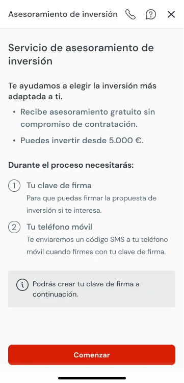
The primary objective of the engagement was introducing a Financial Advisor feature: a personalised guidance system generating product recommendations based on each user's risk profile and financial goals. Meaningful new capability — and a correspondingly complex design problem.
Three tensions shaped the work. First: integrating a substantial new feature into existing architecture without disrupting the coherence of an app that already had its own information model. Second: designing data collection that users would actually trust — asking about financial situation, risk appetite, and long-term goals requires a level of transparency that most financial apps don't achieve. Third: balancing automated guidance with user autonomy — a recommendation engine that feels like a sales tool destroys trust faster than no recommendation at all. Every suggested product needed to show its reasoning.
Progressive disclosure, not progressive complexity
The engagement opened with a discovery phase: customer journey mapping across multiple user entry points to understand how different users moved through the app — what they came for, where they dropped off, and where the information architecture was creating unnecessary friction. That research shaped the layered model the redesign was built around.
The UX architecture was built around progressive disclosure: the default view presents the summary most users need most of the time, with a consistent path to detail available at every level. No feature is hidden — but not every feature needs to be prominent. The Financial Advisor sits at the deepest layer of this hierarchy: always available, never intrusive.
Financial product UX also requires careful attention to the language of trust. How you label a product (pension plan vs. retirement savings), how you present performance data, how you communicate risk — these are design decisions with real consequences for the decisions users make. I worked closely with Mapfre's product and legal teams to define language conventions that would hold across the whole product.
Personalised guidance, with visible reasoning
The advisory feature required designing a data collection flow that users would willingly complete. Asking someone about their financial risk tolerance and long-term goals is sensitive — the design had to communicate clearly why the information was being collected and how it would be used, without burying that context in legal language. Each question was framed in plain terms with transparent purpose.
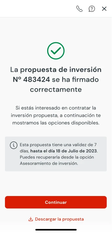
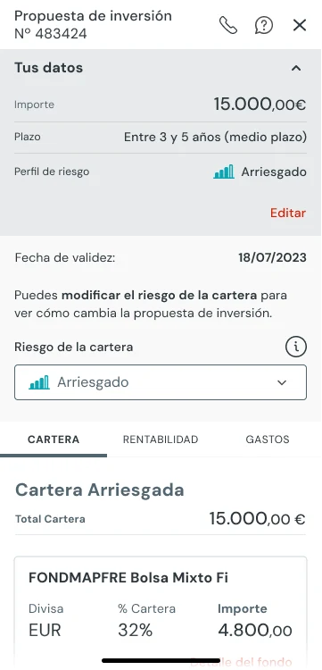
The recommendation output had to earn trust at the point of display: every suggested product was shown with its rationale — why this product, why now, what assumption it was based on. Users could accept a recommendation, modify the inputs that generated it, or ignore it entirely. Preserving that autonomy — making the guidance feel like informed advice rather than a sales funnel — was the defining design constraint of the feature.

When a user tries to leave the advisory flow mid-process, the exit modal intercepts with a callback offer — "We'll call you." Abandonment becomes a route into assisted help rather than a lost session. A small decision with measurable retention implications.
Migration, coordination, and handoff
The engagement included a significant design operations challenge from the outset: the app had an extensive screen library and complete design system built in Sketch, requiring full migration to Figma while active feature development continued in parallel. I planned and led that migration — defining the structure, phases, and effort estimates — ensuring no disruption to ongoing product work throughout.
Coordination with Capgemini, the development partner, was a constant throughout: disciplined handoff and regular multi-team alignment were essential across design, client, and engineering teams operating under different organisational structures. The multi-device scope — desktop, tablet, and mobile — added a further layer of specification and handoff complexity to every delivery.
What financial UX teaches you about trust
Financial products make the stakes of UX decisions visible in a way that consumer apps often don't. A confusing navigation pattern on a streaming service costs a user a few seconds. A confusing navigation pattern on an investment account can contribute to a decision made without sufficient information — with real financial consequences.
That reality focuses design decisions. It also requires a working relationship with compliance and legal that's genuine, not adversarial. The best financial UX I've seen comes from teams where design and legal have learned to speak each other's language — where legal understands why a particular piece of required disclosure doesn't have to be placed in the most disruptive position on the page, and design understands why the disclosure can't be eliminated.
Specific performance data for this engagement is subject to NDA.
Your hardest problem
is a good place to start.
Open to senior product design roles and selective consulting engagements — in English or Spanish.